A Genre is category of music, art or literature. These categories or Genres are used in order to help people decipher if the content in question appeals to them. In my case I am going to be designing a four page spread that revolves around a my friends clothing brand ”Golden”.
It is important to appeal to the audience that will be reading your magazine. It is important to know your target audience of the magazine you are creating in order to appeal to their interests and likes. If I wasn’t to do this no one would buy my magazine. There is a broad range of magazine that will share completely different audience, for example the consumers of the NME and Hello magazine are completely different but they are still successful because they appeal to a broad range of different people.
Here is an analysis of a double page spread that I really like the look of and could possibly draw inspiration from:

My genre is a kind of skate/urban fashion magazine. These tend to be quite jagged and unprofessional looking when compared to other magazines. Here is an example of this:
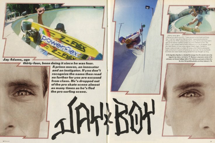
This is possibly the most popular skate boarding magazine ”Thrasher”. Whilst there are elements of this that I like such as the text at the bottom looking as though it is drawn in marker pen. I was researching the demographic profiles of Thrasher magazine in order to understand the kind of audience that my magazine will be reaching. I found some research conducted by the Northern Arizona University in 2001 all about the people who buy and read Thrasher Magazine. I feel as though this gives me a pretty good idea of the kind of people who would read my magazine because this research was conducted when skating was really popular. The research shows that the audience is majority male with 90% of the readers being male, leaving the other 10% female. It also tells me about the age of the people who read Thrasher which are as follows:
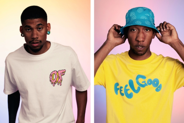
However, when I look at something like this it seems pretty dated to me. The fashion and style of skateboarders has changed a lot, so I think I would like to make my spread look a lot more updated and modern. Something that I think is a good example of this is the rap group Odd Future. They are a group of rappers and skaters etc who have gained worldwide recognition for what they do. They also have their own clothing brand which is incredibly successful. On their website the clothing is modeled by them and the clothing is generally brightly colored and vibrant. This is a trend that has caught on and I think it is something that I would definitely like to incorporate throughout my magazine.
When looking for inspiration for my front cover I stumbled across this Time magazine cover from Andy Warhol:
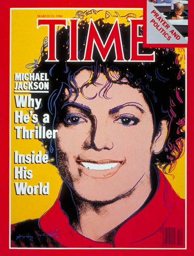
This magazine uses an image of Michael Jackson that clearly has been very edited. It looks as though Andy Warhol has drawn over the original image of him using the vibrant colours and then highlighted certain features of his face. The image used is a close up shot of Michael jackson and I feel as though Andy Warhol has drawn up this image of him to not only show that Michael Jackson is a creative artist but that his legacy is so great that people are painting portraits of him. The masthead is large, at the top of the page and centred. The colour of the masthead matches what Michael Jackson is wearing and then it has a white boarder around the letters. This makes the letters stand out and hopefully draw the reader in. The magazine also tries to entice readers by promising an insight into his world which is something that not many will get to see hence why they’ve advertised it like that.
Obviously this looks pretty dated by today’s standards. But I think if I was to draw inspiration for this pop art kind of style by using vibrant colors ect, it may make my magazine stand out from the others and rather modern when you take into consideration how the skateboarder style has changed.
Here is one of the images I took the other day that I have edited with this kind of pop art style in mind. I think this looks very effective and it is definitely an idea I am going to to try to develop further in relation to my magazine. I think that this can be made very effective if I increase how ‘cartoon’ the image looks. A popular magazine that has cartoons on the from are the french Charlie Hebdo magazines. They use bright, vibrant colours and I think I’d like to try to add this cartoon kind of style to the mix.
From looking into this I stumbled across some of Julian Opie’s art. I recognised this from blurs best of album cover and thought it could be something that I can use as inspiration. I think if I bring out the colours in the image to a really high level I will achieve this cartoon effect. The problem with this is that the colour of skin can become unnatural. You can see in the image above that the skin on his neck has turned a bit yellow. It’d be best to stop this from happening somehow because it’ll look really unprofessional.
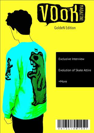
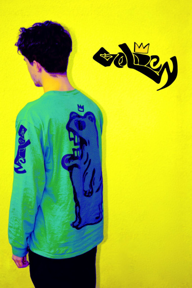
This is what I came up with. I noticed that when I increased the contrast of the green to give it the cartoon effect It didn’t really blend well with the yellow background. So I changed the main colour to a strong sky blue and made the shadows, highlights and some tones a higher contrast version of the original green colour. Also, instead of trying to edit the image in a way that would keep the t-shirt looking the way it does now without effecting the colour of the person’s (Isaac) skin. I decided to layer the image over itself, increase the opacity and then draw around Isaac’s head. I feel like this is effective on an aesthetic and marketing level. This is due to the fact that it shows that the person wearing the clothing isn’t important. The important thing is the clothing and anyone can wear it. When compared to my original image I feel as though it is clear which is the more effective image.
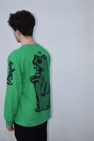
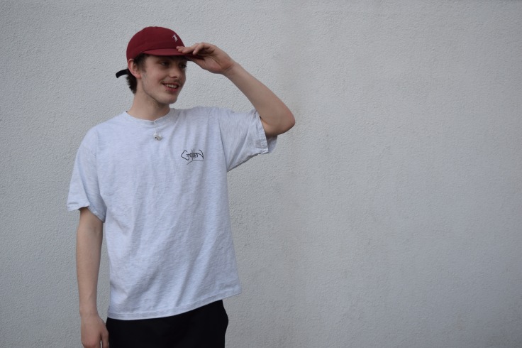
In order to see if this kind of aesthetic design for my magazine would be the kind of thing that would interest the modern skater I met up with the people from Golden that I interviewed and some of their friends. I chose to show them three images: the original front cover image unedited, the first edited version and then my final front cover design. The people that I asked were: Isaac, Durham, Demsi, Olly, and Ted.
I asked them first of all to tell me what they thought of the original image and if it would appeal to modern skaters.
Isaac who is in the picture said:
”It’s a good picture. I like it but if I was to give some advice I’d say it needs editing in some way. It looks a bit dull the way that it is but I think it’s got a lot of potential for you to do something with it”.
Olly who wasn’t available on the day of the interview said:
”I like it because even though theres no (skate)board in the image you still get that kind of vibe from it. Definitely agree that it needs to be a bit more colourful. Or just brighter even.”
Durham: ”It’s too plain for a magazine cover I think. Maybe making the background a solid colour would help”.
Demsi: ”I agree with Isaac I think it’s got potential”.
Ted: ”Yeah theres pretty much nothing else to say other than what’s been said.”
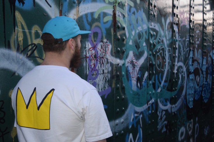
I then showed them the edited version and asked them what they thought of it.
Durham: “That looks so much better. I didn’t think it’d work for a front cover but now you’ve shown me that i can see it. It’s definitely more like it”.
Ted: ”Yeah I would be much more attracted to something that looks like that then the previous one. It’s far more eye catching”.
Isaac: ”The yellow background really makes the image stand out and because of the way you’ve tampered with the colours on me it keeps the vibrancy levels up. It something that I would want our branding on”.
Demsi: ”It’s so much better than before. It really is”.
Olly: ”I like how you can still see the texture of the wall it adds something different to it. It’s subtle but it works really well.”
Finally I showed them my idea for the final cover.
Isaac: ”That’s even better. It’s so vibrant and the colours are so eye catching. The way you’ve drawn around my head works so well because it shows that the clothing can be worn by anyone and I really like that”.
Demsi: ”It kind of shows that the person wearing the clothes isn’t important and the main focus is on the clothing and everything surrounding that. It’s proper different, I don’t think I’ve really seen a magazine cover like that but it works so well. Gives us a good image”.
Ted: ”You’re pretty much instantly drawn to it because of how much the colours stand out and it’s pretty artistic which is a good thing because it gives the brand an artistic feel. Pretty sure that’s what Golden try to come across as so yeah, it looks really good.”
Olly: ”I’d want to buy that magazine. Like if I was getting a train and I was in a shop beforehand looking for something to read on the journey I’d chose that one over the other 100%”.
This audience research was incredibly helpful because it made me feel like I am taking my magazine in the right direction in order to make it appeal to the kind of demographic that I want it to.
For my double page spread that will contain an interview I am going to interview the people behind GoldeN and ask them about their brand. The approach for the interview will to be pick out things that make GoldeN different from other clothing brands. For example GoldeN’s clothes are sold in a place called Alt Seen Eye. This place is a kind of art gallery as well as a shop which is because GoldeN want their clothes to be seen as art as well as clothing.
When I took this image I had the idea to create something similar to this:
I was going to take inspiration from this design and make a transparent white box over the right half of the picture and put my article on that side of the page. By doing this I would have achieved a classic, urban skater look because of the graffiti and my choice of fonts. With this double page spread I am planning on keeping the design elements similar to the front cover of the magazine that I have designed. I feel as though since I designed that front cover it’s changed the direction that I want to take my magazine in. I want to keep up with this bright and kind of cartoony vibe because I feel as though its different and it really captures the aesthetic of the GoldeN brand. The original image that is going to be part of my interview double page looks like this:
I feel as though I can take a sightly different approach with this because the article isn’t directly related to Golden. I plan to continue the yellow theme though in order to keep some kind of consistency. The logic behind not doing the whole cartoon thing again is because I want to show a bit of variety in my designs and show there is a number of things that I can do.

May 5, 2016 at 8:34 am
This is a good start Liam, you need to make sure that you are doing your research still whilst doing your production. Please come and talk to me if you need help or you are unsure of what you need to do. please include a bibliography and quotes (if required ) for any secondary research
LikeLike
May 9, 2016 at 1:32 pm
Liam could you please e mail me your research as you do it. I am a little concerned by the lack of research which is in your blog. If you are struggling please let me know so we can discuss things further.
LikeLike
May 9, 2016 at 1:34 pm
“It is important to appeal to the audience that will be reading your magazine. It is important to know your target audience of the magazine you are creating in order to appeal to their interests and likes.” this is a good point that has been made, please can you conduct a more detailed analysis to develop this further? How do the professionals target their audience?
LikeLike
May 9, 2016 at 1:35 pm
Do you have a reflective journal? If not please start or ask for help if you need it.
LikeLike
May 23, 2016 at 12:49 pm
Well done Liam, we have started some good research! Please look at print copy for further feedback. Try and develop your audience research and provide a more detailed analysis
LikeLike
May 23, 2016 at 12:50 pm
Publish your journal please
LikeLike
June 6, 2016 at 1:36 pm
Liam you have some good statistics at the start of this, please can your source your information and tell me where you got this from (did you find this through a questionnaire or through secondary and if so please reference using Harvard)
LikeLike
June 6, 2016 at 1:39 pm
could you try and develop more of your textual analysis ( Time magazine cover )and discuss the target audience?
Could you check the first few words in this post…is this a quote (about genre) if so please reference.
LikeLike